


All Rights Reserved - NDA signed. For Demo purpose only.
Discovery/Requirements:
As a user who has interests in food, enjoys cooking and exploring new recipes daily; I would like an app on my Samsung smartphone where I can search for a variety of recipe dishes from different parts cultures across the world. I would like to also connect with other cooks or chefs like myself for recipe ideas.
Research and Usability studies:
To empathize with the user as a UI/UX Designer, I created a persona and worked closely with UX Researcher to create a user protocol for research purposes. We created hypothesis to initiate the usability interviews where we found out what the users really want to do and how they would like to do it. We gathered these feedback using wireframes/low fidelity mock-ups, which I created. After successful interviews with 8 users, we reported-out the usability feedback from the sessions to the entire agile team members including Product Owners, Developers, Project Managers, Technical Managers, Testers, co-Designers and Stakeholders. This helped us prioritize and break down the work into smaller features assigned to a group of 3 teams. The teams were able to provide shirt size estimates and breakdown the project on high-level.
Low-fidelity Mock-ups:
At the early stages of discussion, a low-fidelity mock-up was designed to illustrate the information architecture of the application features, highlighting user navigation and steps the user needs to take to complete their task.
High-fidelity Mock-ups:
I created high-fidelity mock-ups that showcase user journey and failure risks which was informed by the results of our usability studies. The mock-ups helped the team estimate the feature size, understand the requirements, carry out spikes and risk analysis were needed, as well as create storyboards for the features and prioritize them into two-weeks sprints.
Prototype and Usability Testing:
With the feedback gathered from research studies and planning, we were able to create an MVP prototype in 6 months. While collaborating with the UX Researcher and other observing team members, we carried out series of feature based usability tests with the same users to gathered more feedback on areas of improvement.
This was an iterative process till v1.0.2 and ready to ship but its release was suspended by the clients for internal reasons. Tools used for this project was Figma, CorelDraw, JIRA and Balsamiq
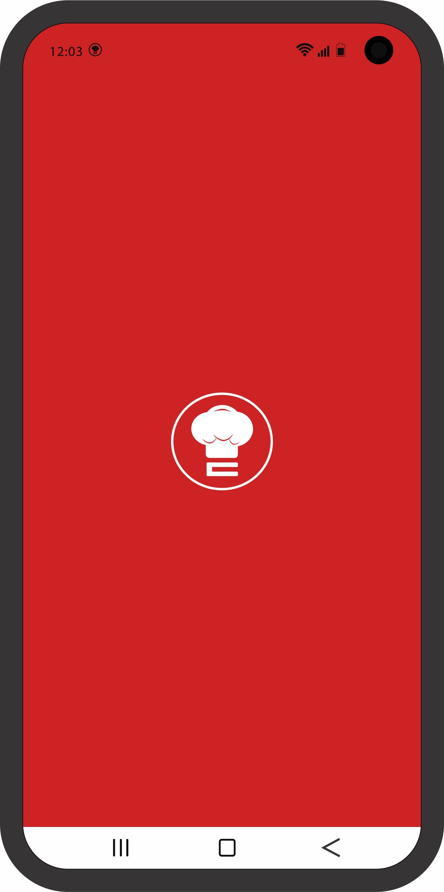
The status bar should remain red at this point.
This logo icon should display while app is running in the background.
The logo must be centralized on the screen.
The bar at the bottom will remain white or default on all screens.
The status bar changes display to white here and throughout the entire app screens.
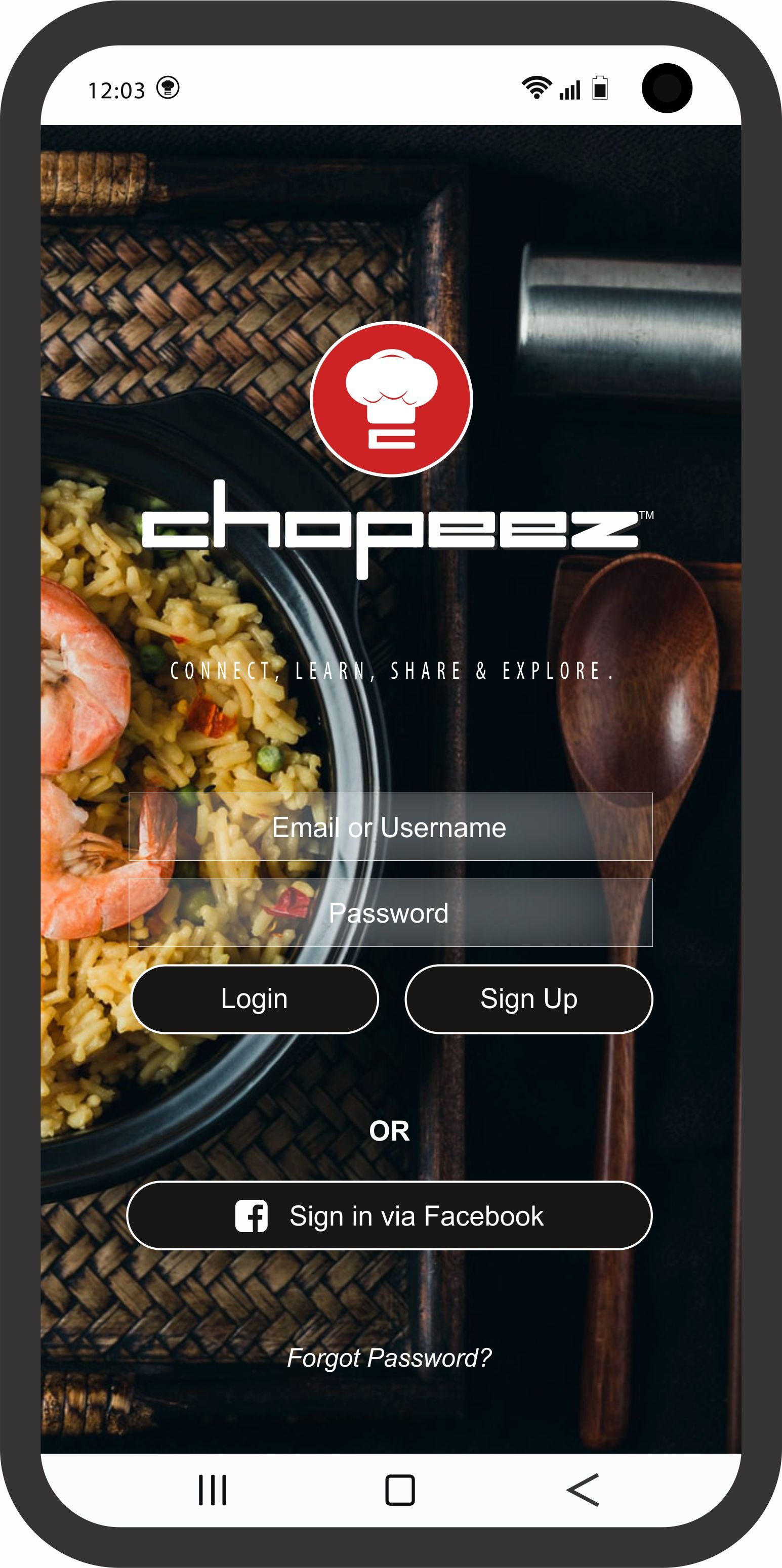
The dialogue box will be transparent or a light fill of the background color.
The buttons will have a fill as displayed in image (Brown).
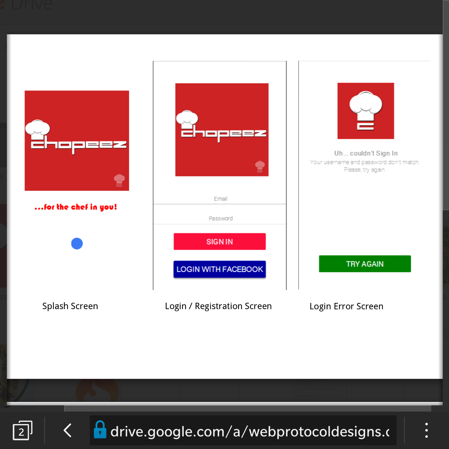
User can log in with Username and Password or Facebook
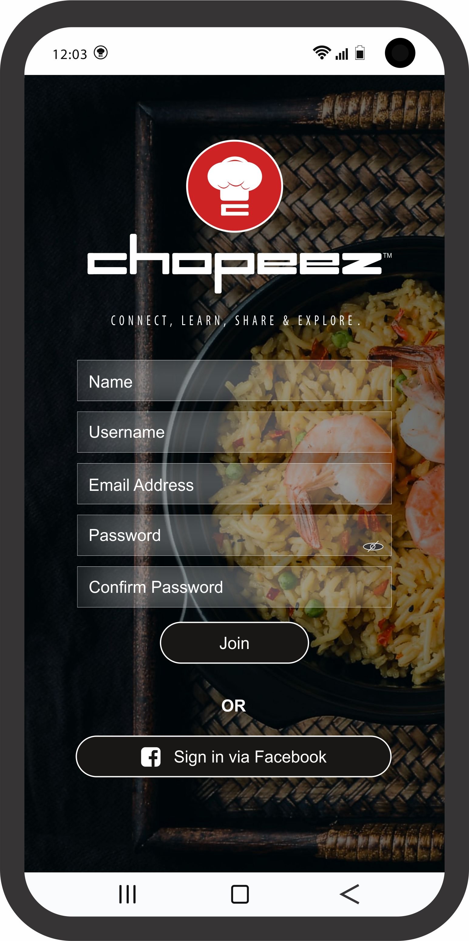
Sign-up for New Users
The dialogue box will be transparent or a light fill of the background color.
The buttons will have a fill as displayed in image (Brown).
User credentials will save to Database (Firebase) for future recognition at log in attempt
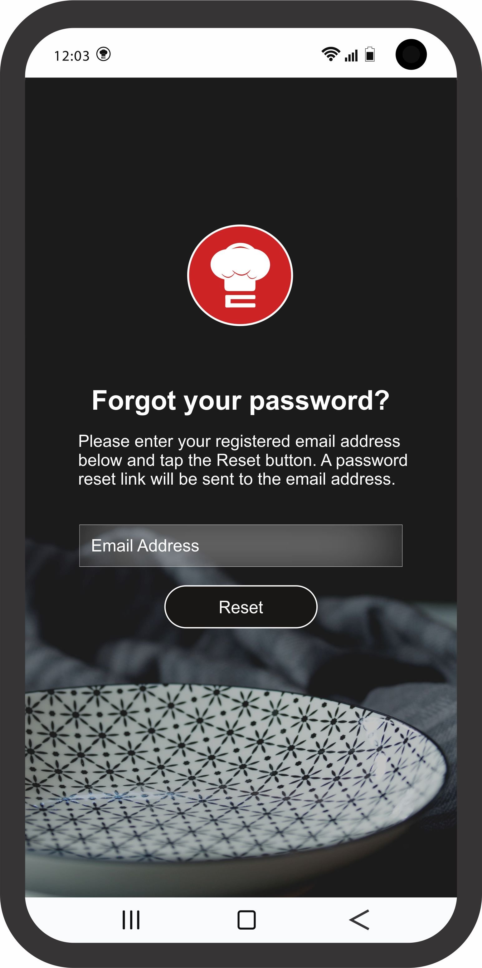
The dialogue box will be transparent or a light fill of the background color.
The button will have a fill as displayed in image (Black).
User fills out dialogue box with their Sign-Up email and upon reset click, a new password should be generated and send to registered email. Authentication process to retrieve account
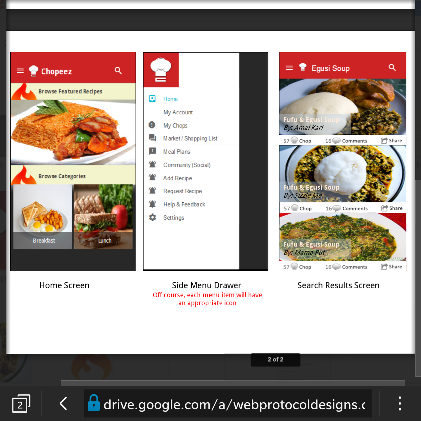
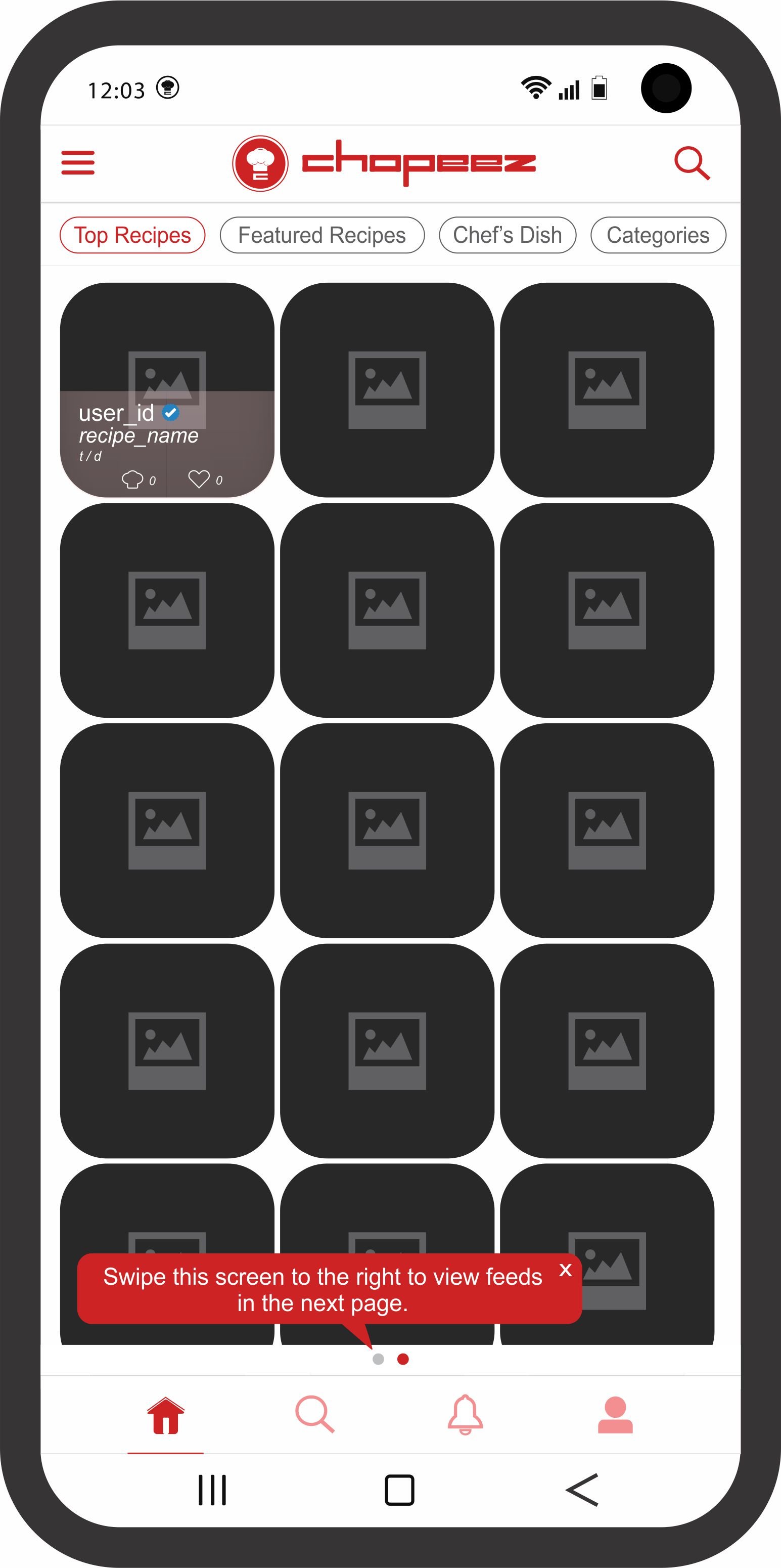
This page will refresh and update latest feeds (*posted as recipe*) randomly within the set, when dragged down putting the following clauses in place;
In the case of TOP RECIPES- The feeds will pull and display recipes posted by any user in an order of priority based on highest counts of interactions (CHOPS & LIKES) daily. In a case where there are no interaction counts on posts, the priority switches to recipes posted by verified accounts and then to accounts with most followers respectively. All these will reference real-time in display (i.e the most recent posts will always appear first).
In the case of FEATURED RECIPES- The feeds will pull and display recipes posted STRICTLY by collaborators (Chefs) and verified accounts with highest counts of interactions (CHOPS & LIKES) ONLY. Collaborators will top this list and the posts will reference real-time in display (i.e the most recent posts will always appear first).
In the case of CHEF'S DISH- The feeds will pull and display recipes posted STRICTLY by collaborators (Chefs) ONLY while disregarding interaction counts (i.e whether or not the post has interactions it will appear here). See this screen as a page where all Chef's posts will appear with reference to real-time in display (i.e the most recent posts will always appear first).
In the case of CATEGORIES- The feeds will pull and display recipes under its category according to the option selected by the user when creating the post, if categorized (e.g. Breakfast, Lunch, Dinner, etc). To further explain this, categorizing a recipe will be optional to a user.
The SEARCH icon when clicked displays a dialogue box that enables users search for any content stored on the entire user database, which they have permission to view. (*Includes user accounts, posts/recipes & hash-tags*)
All the cards listed in grid view should be clickable- When a user clicks on any of the cards, it should display details of that recipe on a new screen as shown in the mock-up of RECIPE DETAILS SCREEN.
The arrow labeled RECIPES is a button that returns user to the HOME RECIPES SCREEN following the users chain of navigation.
The image/video for all posts/recipes will be set to a particular dimension for uniformity and neatness. across the app.
*A suggested dimension is 640 x 640 which should fit the screen as shown in the mock-up design.*
All buttons SHARE, LIKE & CHOP that appear on any screen will carry out the same function as explained earlier.
The "VIEW COMMENTS" button drops when clicked, allowing the user view previous comments under that post. It will also have a dialogue box at the bottom that permits the user COMMENT/REPLY under the post. The COMMENTS icon button should record and count per user comment/reply submitted under the post.
POSTS tab will display as shown in mock-up while INGREDIENTS & STEPS will follow the pattern from our previous design model
The arrow returns user to Chef Dish page.
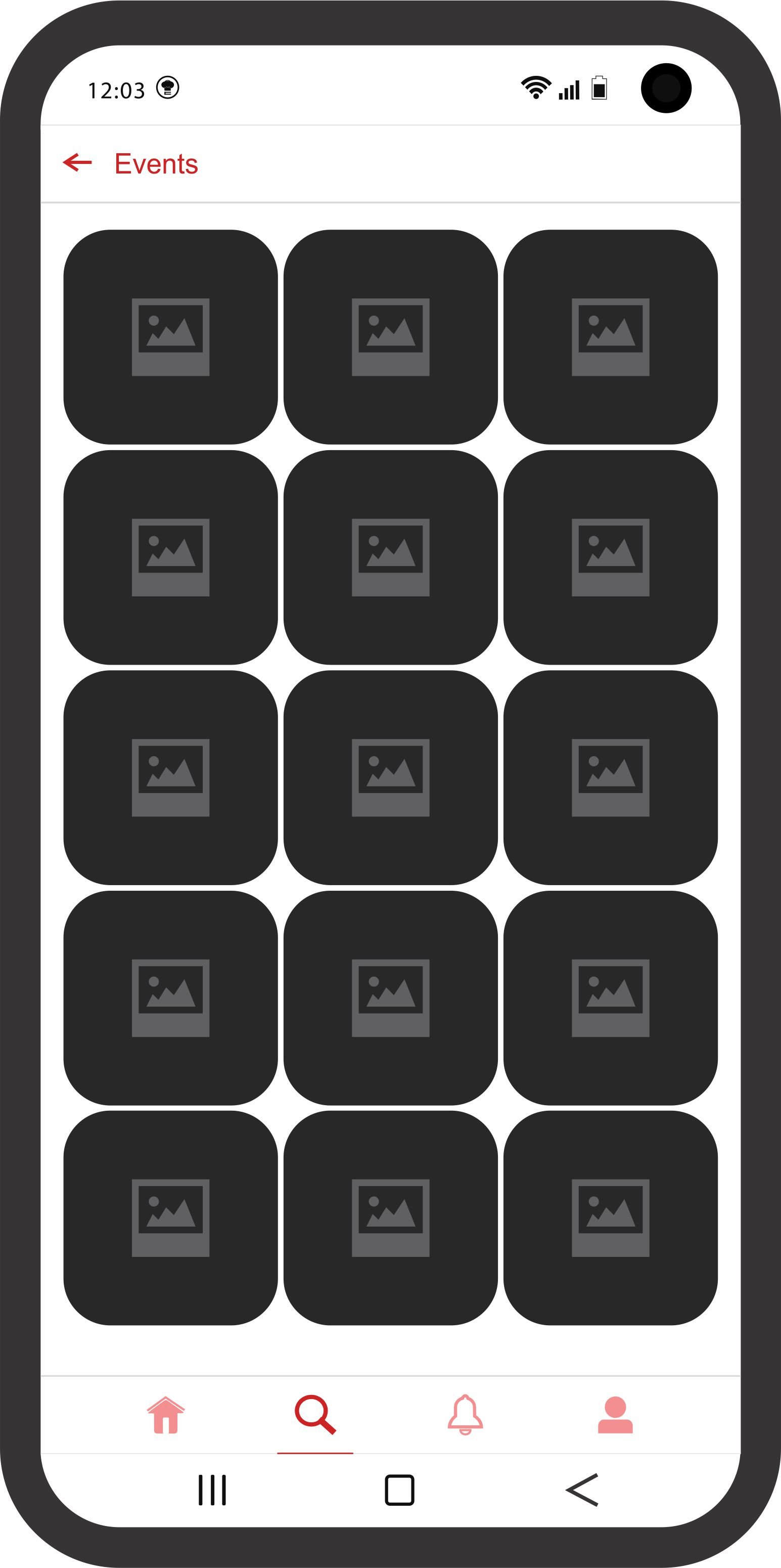
Posts that have been tagged “As an event” by a user, in an order of
MOST interactions (Chops & Likes) in real-time (daily) will refresh
here at intervals.
The arrow returns user to Explore or Home page, depends on where it was navigated from.
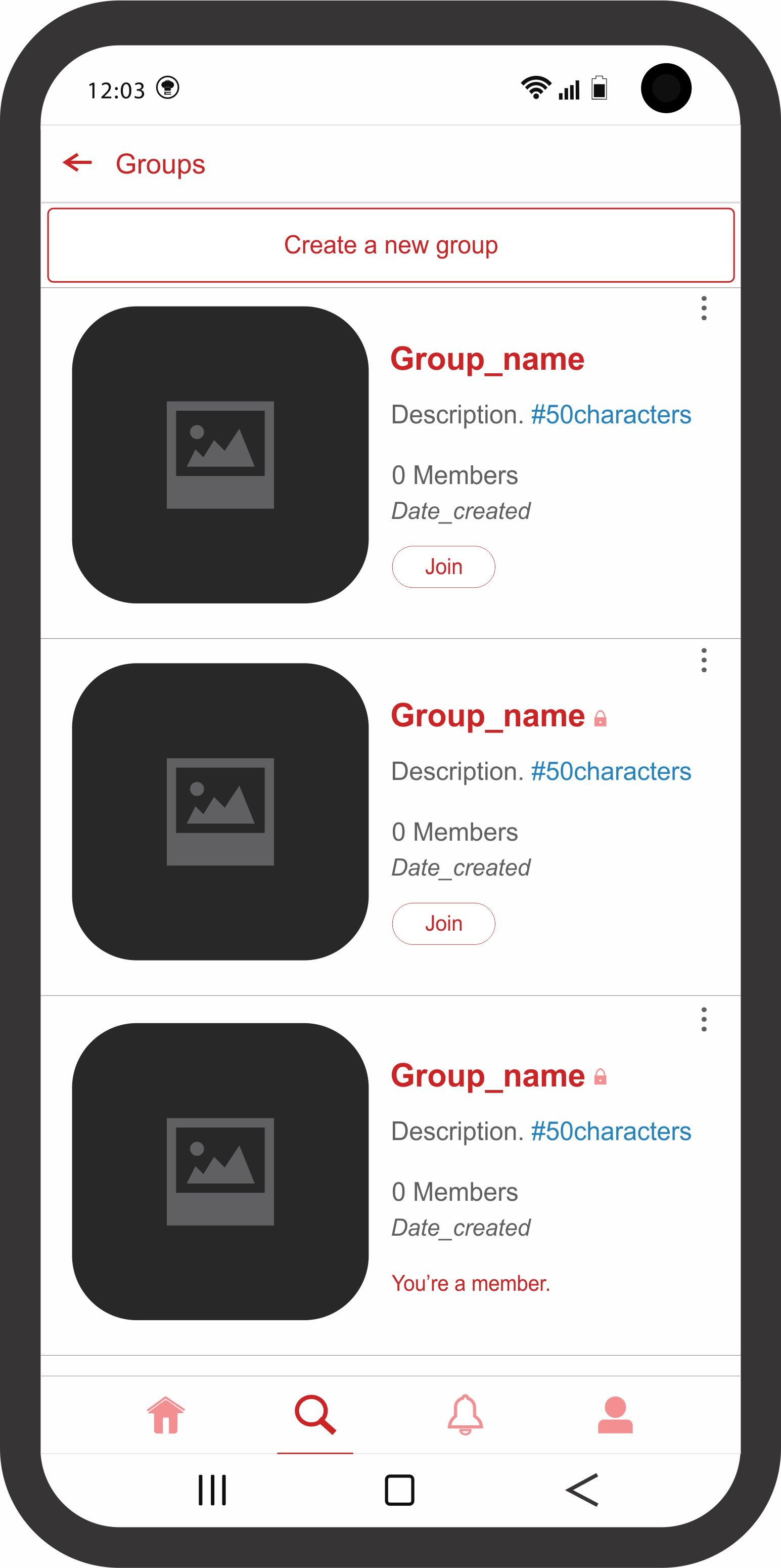
This is a dialogue box that permits a user to Create a new group and the maximum members that can make a complete group should not be more than 30. We can increase later in future versions depending on user experience and feedbacks
This “join” button will permit a user to automatically Join an open group when clicked but if clicked on a closed/private group, it will require the admin’s permission.
A closed/private group will display the padlock sign next to the group name as shown in the second & third group shown in the image.
The menu allows non-admin users do a few things; Report or Block, Leave & Share. This menu molds differently for admin users to include; Delete, Invite & Share.
This displays for groups that the user is already a member and users can only be in a maximum of 3 different groups at a time or less (It’s open for us to discuss if you have any concerns but I feel like it will give the users a limit to creating irrelevant/unnecessary groups that will just take up storage. Also it is wired in such a way that no matter what role you play either as a member or an admin you can only be in 2-3 groups at a time; you will have to give up one to join or create another).